# WPF Layout and Resizing
> Arrange the WPF TextControl, ButtonBar, RulerBar and StatusBar in a DockPanel or Grid with GridSplitter, and choose the ViewMode that fits a resizing window.
- **Product:** TX Text Control .NET for WPF
- **Section:** Documentation
- **Kind:** Topic
- **Path:** TX Text Control .NET for WPF > Integration Guide > WPF Layout and Resizing
- **2972 words**
- **Web URL:** https://docs.textcontrol.com/tx-text-control-dotnet-wpf/integration/layout/
- **LLMs URL:** https://docs.textcontrol.com/tx-text-control-dotnet-wpf/integration/layout/llms.txt
- **LLMs-Full URL:** https://docs.textcontrol.com/tx-text-control-dotnet-wpf/integration/layout/llms-full.txt
---
The WPF `TextControl` takes the size its panel gives it, like any other control, and fills it with the document. Getting the layout right therefore comes down to the panel: a `DockPanel` for the editor and its bars, a `Grid` when the editor shares the window with other content, and a view mode that decides whether the text follows the width of the control or the size of a page. The sections below cover each of these for windows that resize.
### How the Editor Gets Its Size
- **The panel decides.** In a `Grid` cell or as the last child of a `DockPanel`, the `TextControl` stretches to the space left over and resizes with the window. Leave its `Width` and `Height` unset; Visual Studio adds both when you drop the control from the toolbox, and the tutorials remove them.
- **The editor scrolls itself.** The template of the `TextControl` contains a `ScrollViewer` that shows the visible part of the document (see [TextControlDocument](https://docs.textcontrol.com/tx-text-control-dotnet-wpf/integration/data-binding/textcontroldocument/llms-full.txt)). Don't put the control into another `ScrollViewer` or into a `StackPanel`, which give their children as much space as they ask for instead of the space of the window.
- **Scroll bars are dependency properties.** [HorizontalScrollBarVisibility](https://docs.textcontrol.com/tx-text-control-dotnet-wpf/reference/txtextcontrol-wpf/textcontrol/horizontalscrollbarvisibility-property/llms-full.txt) and [VerticalScrollBarVisibility](https://docs.textcontrol.com/tx-text-control-dotnet-wpf/reference/txtextcontrol-wpf/textcontrol/verticalscrollbarvisibility-property/llms-full.txt) take the `System.Windows.Controls.ScrollBarVisibility` values of WPF, such as `Auto` or `Disabled`.
- **The border** is [BorderThickness](https://docs.textcontrol.com/tx-text-control-dotnet-wpf/reference/txtextcontrol-wpf/textcontrol/borderthickness-property/llms-full.txt), a `Thickness` like that of other WPF controls.
### Arrange the Editor and Its Bars in a DockPanel
A `DockPanel` places each child at the side named by `DockPanel.Dock` in the order of the XAML, and gives the last child the rest. The bars come first and the `TextControl` last:
```xml
```
The button bar and the horizontal ruler stack at the top in this order, the status bar spans the bottom, and the vertical ruler sits at the left of the editor. Because the status bar comes before the vertical ruler, it runs under the ruler across the full width. The second `RulerBar` shows a vertical scale because it is docked at the left and stretched vertically, and it works as the vertical ruler of the editor because `VerticalRulerBar` names it:
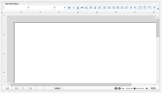
The bars are connected to the editor by name, not by their place in the panel. [Create Your First WPF Application](https://docs.textcontrol.com/tx-text-control-dotnet-wpf/getting-started/document-editor/first-application/llms-full.txt) builds this window with the toolbox, and [Rulers and Status Bar](https://docs.textcontrol.com/tx-text-control-dotnet-wpf/document-editor/ribbon-ui/rulers-status-bar/llms-full.txt) describes the settings of the bars. In a ribbon window, the `Ribbon` is the first child, docked at the top; [Connecting Ribbon Tabs in XAML](https://docs.textcontrol.com/tx-text-control-dotnet-wpf/document-editor/ribbon-ui/ribbon-xaml/llms-full.txt) shows it.
### Place the Editor in a Grid
When the window holds more than the editor, such as a list of documents, a `Grid` divides it, and a `GridSplitter` lets the user move the border. The editor and its bars keep their `DockPanel`, which fills one cell of the grid:
```xml
```
The XAML works as follows:
- The first column has a fixed start width and a minimum, the second holds the splitter, and the third, with `Width="*"`, takes the rest of the window. `MinWidth="300"` keeps the editor usable when the user drags the splitter to the right.
- The `GridSplitter` in its own `Auto` column resizes the columns on both sides of it.
- The `DockPanel` in the third column arranges the editor and its bars as in the previous section. The vertical ruler is placed by the `DockPanel`, as in the samples of Text Control, rather than by a cell of the grid.
Run the application and drag the splitter: the editor, the rulers and the status bar follow the new width.
### Let the Document Follow the Control
What happens to the text when the control changes its size depends on [ViewMode](https://docs.textcontrol.com/tx-text-control-dotnet-wpf/reference/txtextcontrol-wpf/textcontrol/viewmode-property/llms-full.txt):
| `ViewMode` | Text is formatted | Suits |
|---|---|---|
| `PageView` | According to the page size and margins; pages are shown with gaps on a background, headers and footers included | Documents that are printed or exported |
| `Normal` | According to the page size and margins, with scroll bars; headers and footers are not displayed | Editing page-based documents without the page view |
| `FloatingText` | To the width of the control, with a vertical scroll bar; page size and margins are ignored | Notes, messages and other text without pages |
| `SimpleControl` | To the width and height of the control; when the control is full, no more text can be typed | Small fields in a form |
With `PageView` and `Normal`, the line breaks follow the page, so they stay the same when the window gets narrower. With `FloatingText`, the text is formatted to the width of the control, which changes with the window. `ViewMode` is a dependency property, so a style or a binding can set it. [Viewing, Zooming, and Navigation](https://docs.textcontrol.com/tx-text-control-dotnet-wpf/document-editor/viewing/llms-full.txt) covers the view modes and the zoom.
In `SimpleControl` mode, [AutoControlSize](https://docs.textcontrol.com/tx-text-control-dotnet-wpf/reference/txtextcontrol-wpf/textcontrol/autocontrolsize-property/llms-full.txt) can let the control grow or shrink with its text. It takes an [AutoSize](https://docs.textcontrol.com/tx-text-control-dotnet-wpf/reference/txtextcontrol/autosize/llms-full.txt) object whose `AutoExpand` and `AutoShrink` properties set the directions; the events [VExpanded](https://docs.textcontrol.com/tx-text-control-dotnet-wpf/reference/txtextcontrol-wpf/textcontrol/vexpanded-event/llms-full.txt) and `HExpanded` report that the control has expanded.
### Show and Hide Parts of the Layout
The bars and sidebars are WPF elements. Setting the `Visibility` of a bar to `Collapsed` removes it from the layout, and the `DockPanel` gives its space to the editor; [Rulers and Status Bar](https://docs.textcontrol.com/tx-text-control-dotnet-wpf/document-editor/ribbon-ui/rulers-status-bar/#show-and-hide-the-bars) shows this and the check boxes of the ribbon that do the same for the user. A [Sidebar](https://docs.textcontrol.com/tx-text-control-dotnet-wpf/reference/txtextcontrol-wpf/sidebar/llms-full.txt), docked at a side of the `DockPanel` like a ruler, opens and closes through its `IsShown` property; [Sidebar and Panels](https://docs.textcontrol.com/tx-text-control-dotnet-wpf/document-editor/ribbon-ui/sidebar/llms-full.txt) places sidebars in the window.
### Next Steps
- [Resource Dictionaries and Styling](https://docs.textcontrol.com/tx-text-control-dotnet-wpf/integration/styling/llms-full.txt): styles for the editor and the bars of the whole application.
- [Embedding the Editor in Windows and UserControls](https://docs.textcontrol.com/tx-text-control-dotnet-wpf/integration/embedding/llms-full.txt): the editor in a `UserControl`, a tab or a dialog window.
- [DPI and Display Scaling](https://docs.textcontrol.com/tx-text-control-dotnet-wpf/integration/dpi-scaling/llms-full.txt): the layout on displays with a scale factor.
- [Viewing, Zooming, and Navigation](https://docs.textcontrol.com/tx-text-control-dotnet-wpf/document-editor/viewing/llms-full.txt): view modes and zoom.
---
## Nearby
- **Previous:** [Commands and Input Bindings](https://docs.textcontrol.com/tx-text-control-dotnet-wpf/integration/commands/llms-full.txt)
- **Next:** [Resource Dictionaries and Styling](https://docs.textcontrol.com/tx-text-control-dotnet-wpf/integration/styling/llms-full.txt)