TX Text Control is a royalty-free, fully programmable rich edit control that offers developers a broad range of word and document processing features in a reusable component designed for Visual Studio. It provides comprehensive text formatting, powerful mail merge features and all word processing key concepts such as table support, images, headers and footers and page sections.
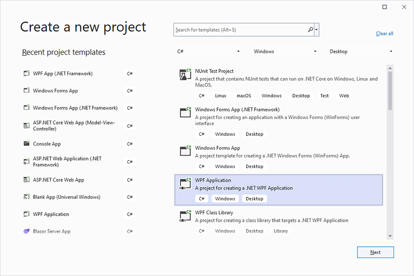
1. Open Visual Studio 2022 and create a new project. Select C# or Visual Basic from the Languages drop-down list, Windows from the Platform list and Desktop as the Project Type. Find the project template WPF App and confirm with Next.
2. Specify a project name confirm with Next.
3. Select your preferred Framework version such as .NET 6 (Long-term support) and confirm with Create.
1. Select the project in the Solution Explorer and click Project -> Manage NuGet Packages... from the main menu.
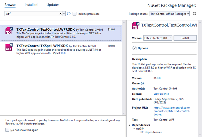
2. Select Text Control Offline Packages as the Package source and click Browse.
3. Select TXTextControl.TextControl.WPF.SDK and click Install.
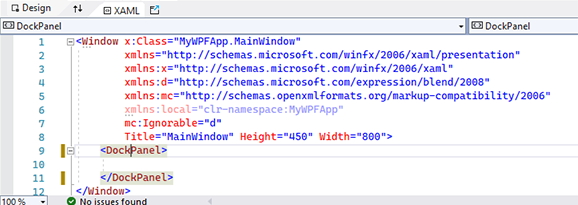
4. In the XAML view, replace the Grid with a DockPanel control as shown in the below screenshot:
In the next steps, the order in which the controls are added to the Window is important.
Double-click the ButtonBarin the toolbox to add it to the Window. For the first element, you will receive a warning to restart the designer. Click OK to confirm.
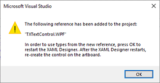
Select Build Solution from the Build main menu.
Make sure that the Window is selected and not the inserted ButtonBar before adding the following elements.
5. Repeat this for the RulerBar, StatusBar, a second RulerBar and finally TextControl.
6. In the XAML, remove the Height and the Width properties for all added elements.
7. Name all elements according to the following screenshot: buttonBar1, rulerBar1, statusBar, rulerBar2 and textControl1.
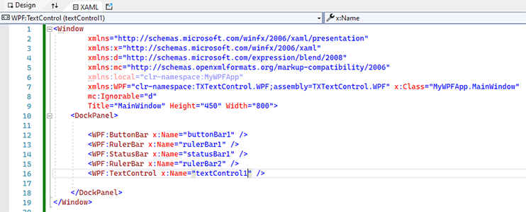
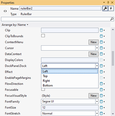
8. Select the secondly added Ruler Bar rulerBar2 using the mouse in the Design view to change the properties in the Properties window.Browse for the DockPanel.Dock property and change it to Left.
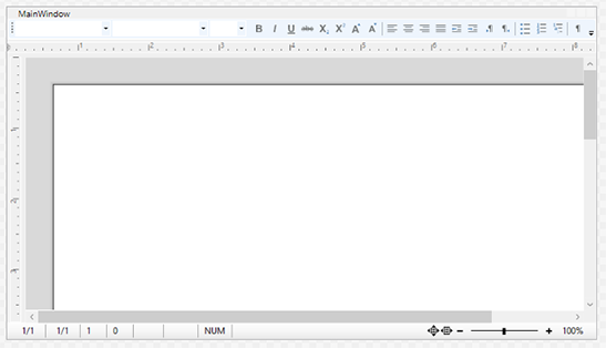
Additionally, set the HorizontalAlignment to Left and theVerticalAlignment to Stretch. The Design view should look like this:
9. Now, the controls must be connected. Therefore, select textControl1 to open it'sproperties in the Properties window of Visual Studio. First, look for the ButtonBarproperty and type in the name of the added Button Bar: buttonBar1.
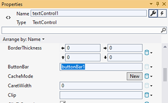
Set the RulerBar property to rulerBar1, StatusBar to statusBar1 and VerticalRulerBar to rulerBar2.
10. In the XAML, add the Loaded="textControl1_Loaded" event handler to the TextControl element as a parameter, so that the line looks like this:
<WPF:TextControl Name="textControl1" Loaded="textControl1_Loaded"
ButtonBar="buttonBar1" StatusBar="statusBar1" RulerBar="rulerBar1" VerticalRulerBar="rulerBar2"/>Right-click on textControl1_Loaded and choose Go To Definition from the opened context menu. Add the following code to the event handler:
private void textControl1_Loaded(object sender, RoutedEventArgs e)
{
textControl1.Focus();
}private void textControl1_Loaded(ByVal sender As Object, ByVal e As RoutedEventArgs)
{
TextControl1.Focus
}Now, press F5 to compile and start the application.