Sidebar
Search results, styles, comments, tracked changes and the merge fields of a template are easier to work with in a panel beside the document than in a dialog box that covers it. The WPF Sidebar is such a panel: it shows one of ten predefined panels or an element of your own, pinned into the window or floating as a dialog. What follows introduces the panels, the layouts, the ribbon buttons that open a sidebar and your own content, with links to the pages that configure each of them.
What the Sidebar Is
Sidebar in the TXTextControl.WPF namespace is a control, derived from System.Windows.Controls.Control, that gives quick access to a feature of a TextControl or to a FrameworkElement of your own. It must be placed inside another element, typically a DockPanel that also holds the editor, and it is one of the items of the TX Text Control 34.0 toolbox tab.
Two properties decide what a sidebar shows:
- TextControl names the editor that the predefined panels work with, by the
Nameof theTextControl. - ContentLayout selects the panel. Its default is
None, which shows nothing.
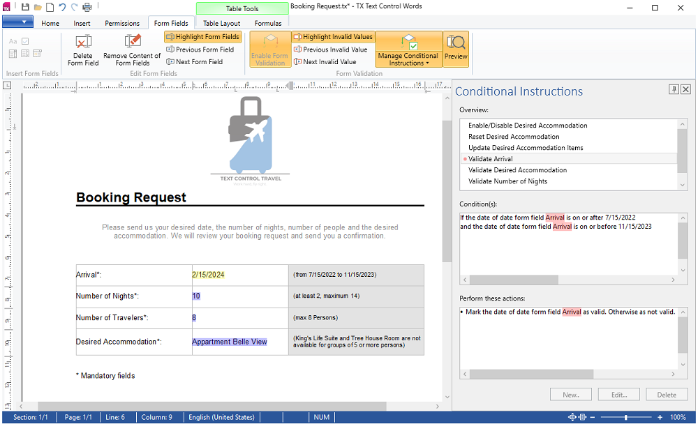
The following picture shows the Conditional Instructions panel of the TX Words sample, pinned at the right of the window, with its pin and close buttons in the title bar:
The Predefined Panels
Sidebar.SidebarContentLayout has a value for each panel, from Find and Styles to FieldNavigator, ConditionalInstructions and DocumentSettings. The Panels describes each one, and Adjust the Title and the Elements of a Panel shows how to hide an element of a panel by its name.
Layout, Pinned or as a Dialog
The alignment of a sidebar decides whether its panel is arranged for a place beside the document or for a strip above or below it, and users can resize it and pin it into the window or let it float as a dialog. Place Sidebars in XAML explains the layouts and showing or hiding a sidebar with IsShown, and Show a Sidebar as a Dialog sets the style, size and location of the dialog. The title uses Calibri Light at size 24 by default.
Open Sidebars From Ribbon Buttons
The Home, Proofing, Form Fields and Reporting tabs have properties that take the name of a sidebar, and a click on the button opens the sidebar with the matching panel. Open Sidebars With Ribbon Buttons lists these properties and shows the XAML.
Show Your Own Content
With ContentLayout set to Custom, a sidebar shows any FrameworkElement of your own, with the same title bar, docking and dialog mode as a predefined panel. Show a Panel of Your Own shows the code.
Next Steps
- Add a Sidebar — add a sidebar to a window step by step.
- Sidebar and Panels — configure the panels and their items in detail.
- Ribbon Tabs, Toolbars, Rulers, and Status Bar — the tabs whose buttons open the sidebars.
- Track Changes and Comments — the features behind two of the panels.