
Toolbars and Mini Toolbars
A WPF editor without a ribbon uses the ButtonBar, a WPF ToolBar that TX Text Control fills with font and paragraph commands. With or without a ribbon, mini toolbars add a small formatting pop-up next to the text the user selects or right-clicks. Both are standard WPF elements underneath, so you remove, move and add their items with the WPF APIs you know.
Connect Rulers, Toolbars, and a Status Bar places the button bar in a window for the first time.
The Button Bar
The ButtonBar shows and sets the font and paragraph attributes of the TextControl that names it in its ButtonBar property. In XAML, the button bar is docked at the top of a DockPanel, and the connection is the name of the element:
<DockPanel>
    <WPF:ButtonBar x:Name="buttonBar" DockPanel.Dock="Top"/>
    <WPF:TextControl x:Name="textControl" ButtonBar="buttonBar"/>
</DockPanel>
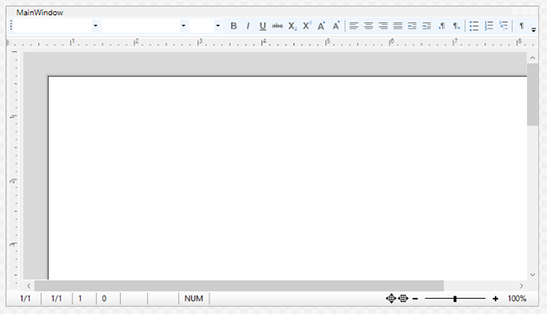
The Items of the Button Bar
ButtonBar derives from System.Windows.Controls.ToolBar, and its buttons and combo boxes are ordinary items of its Items collection. Each has a Name that is a value of ButtonBar.ButtonBarItem:
| Items | Values |
|---|---|
| Combo boxes | TXITEM_StyleName, TXITEM_FontFamily, TXITEM_FontSize, TXITEM_ZoomFactor |
| Character formatting | TXITEM_Bold, TXITEM_Italic, TXITEM_Underline, TXITEM_Strikeout, TXITEM_Subscript, TXITEM_Superscript, TXITEM_IncreaseFont, TXITEM_DecreaseFont |
| Paragraph formatting | TXITEM_LeftAligned, TXITEM_Centered, TXITEM_RightAligned, TXITEM_Justified, TXITEM_DecreaseIndent, TXITEM_IncreaseIndent, TXITEM_LeftToRight, TXITEM_RightToLeft |
| Lists and view | TXITEM_BulletedList, TXITEM_NumberedList, TXITEM_StructuredList, TXITEM_ControlChars |
FrameworkElement.FindName with the string of a value returns the item. You can sort, remove or move items in code, and add items of your own in code or in the collection editor of Items in the designer.
Change the Items in Code
Remove Buttons From the Button Bar in the tutorial Connect Rulers, Toolbars, and a Status Bar removes items with FindName and Items.Remove. The following code, in the Loaded event handler of the TextControl, adds a separator and a button of your own at the end of the bar:
using System.Windows;
using System.Windows.Controls;

private void TextControl_Loaded(object sender, RoutedEventArgs e)
{
    // Add a separator and a Print button
    System.Windows.Controls.Button printButton = new System.Windows.Controls.Button() { Content = "Print" };
    printButton.Click += (s, args) => textControl.Print("My Document", false);
    buttonBar.Items.Add(new Separator());
    buttonBar.Items.Add(printButton);
}
Items of your own are any WPF controls. Their handlers call the TextControl, here Print, which opens the print dialog.
Mini Toolbars
A MiniToolbar is a contextual tool bar that opens next to the mouse position. It derives from System.Windows.Controls.Primitives.Popup. There are two:
- The TextMiniToolbar for selected text, the text at the input position and tables, with font, styles and table groups. Its items are named after TextMiniToolbar.RibbonItem.
- The ObjectMiniToolbar for a selected text frame, drawing frame or barcode frame. Its items are named after ObjectMiniToolbar.RibbonItem. It opens only with the right mouse button.
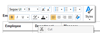
Turn Them On
By default, no mini toolbar opens. ShowMiniToolbar takes values of TXTextControl.MiniToolbarButton: None, the default, LeftButton for a mini toolbar when the left mouse button is released over selected text, and RightButton for one when the right mouse button is released. In XAML, combine both with a comma:
<WPF:TextControl x:Name="textControl" ShowMiniToolbar="LeftButton, RightButton"/>
In code, write textControl.ShowMiniToolbar = TXTextControl.MiniToolbarButton.LeftButton | TXTextControl.MiniToolbarButton.RightButton;. The context menu that opens with the right mouse button is covered in Context Menus.
Change the Structure Once
Right after a mini toolbar has been created, the TextControl raises TextMiniToolbarInitialized or ObjectMiniToolbarInitialized. This is where groups are added or removed.
The compiled event names differ from the reference. In the assembly of version 34.0, the two events are named TextMiniToolbarInitalized and ObjectMiniToolbarInitalized, without the second "i" of "Initialized". Attach your handlers with these names, in XAML and in code; the names of the reference do not compile.
The groups of a WPF mini toolbar sit in a Grid, which its Container property returns: each group is a child of the grid in a column of its own. The following handler removes the table group of the text mini toolbar:
private void TextControl_TextMiniToolbarInitialized(object sender,
    MiniToolbarInitializedEventArgs e)
{
    // Remove the table layout group from the text mini toolbar
    UIElement tableGroup = e.MiniToolbar.Container.FindName(
        TextMiniToolbar.RibbonItem.TXITEM_TableLayoutGroup.ToString()) as UIElement;
    e.MiniToolbar.Container.Children.Remove(tableGroup);
}
Attach it on the TextControl element with TextMiniToolbarInitalized="TextControl_TextMiniToolbarInitialized".
- MiniToolbarInitializedEventArgs.MiniToolbar is the new mini toolbar. You can change it or assign another
MiniToolbarto replace it. - To add a group, add a
ColumnDefinitionto the grid, create aGridor panel with your controls, set its column withGrid.SetColumnand add it toContainer.Children. The Howto sample MiniToolbar, installed in %USERPROFILE%\Documents\TX Text Control 34.0.NET for WPF\CSharp\Howto\MiniToolbar, adds an Edit Hyperlink group this way, with aRibbonButtonwhose icon comes from theResourceProvider:
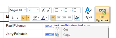
Decide Each Time It Opens
MiniToolbarOpening occurs each time a mini toolbar is about to open. Toggle the visibility of groups here instead of adding them:
- MiniToolbarContext says where the user clicked, as a combination of ContextMenuLocation values such as
TextSelection,TableorSelectedFrame. - MiniToolbar is the mini toolbar that opens; assign another to show it instead. HorizontalOffset and VerticalOffset give its position relative to the top-left corner of the screen.
- The arguments derive from
CancelEventArgs, soe.Cancel = truekeeps the mini toolbar closed.
private void TextControl_MiniToolbarOpening(object sender, MiniToolbarOpeningEventArgs e)
{
    // No mini toolbar for selected frames
    if ((e.MiniToolbarContext & TXTextControl.ContextMenuLocation.SelectedFrame) != 0)
    {
        e.Cancel = true;
    }
}
Attach it with MiniToolbarOpening="TextControl_MiniToolbarOpening"; this event name is the same in the reference and the assembly.
Show a Group Only in Its Context
A group added in TextMiniToolbarInitalized is shown every time the mini toolbar opens. To show the Edit Hyperlink group of the MiniToolbar sample only when the user clicks a link, keep a reference to the group when you add it, and set its Visibility each time the mini toolbar opens:
// The group added to the text mini toolbar, kept to show or hide it later
private Grid editHyperlinkGroup;

private void TextControl_TextMiniToolbarInitialized(object sender,
    MiniToolbarInitializedEventArgs e)
{
    Grid container = e.MiniToolbar.Container;

    // A new column for the group
    container.ColumnDefinitions.Add(new ColumnDefinition() { Width = GridLength.Auto });

    System.Windows.Controls.Ribbon.RibbonButton editButton =
        new System.Windows.Controls.Ribbon.RibbonButton() { Label = "Edit Hyperlink" };
    // Open the built-in dialog box for the link at the input position
    editButton.Click += (s, args) => new HyperlinkDialog(textControl) { Owner = this }.ShowDialog();

    editHyperlinkGroup = new Grid();
    editHyperlinkGroup.Children.Add(editButton);
    Grid.SetColumn(editHyperlinkGroup, container.ColumnDefinitions.Count - 1);
    Grid.SetRowSpan(editHyperlinkGroup, 3);
    container.Children.Add(editHyperlinkGroup);
}

private void TextControl_MiniToolbarOpening(object sender, MiniToolbarOpeningEventArgs e)
{
    if (e.MiniToolbar is TextMiniToolbar && editHyperlinkGroup != null)
    {
        // Show the group only for a click into a hypertext link
        bool isLink = (e.MiniToolbarContext & TXTextControl.ContextMenuLocation.TextField) != 0
            && textControl.HypertextLinks.GetItem() != null;

        editHyperlinkGroup.Visibility = isLink ? Visibility.Visible : Visibility.Collapsed;
    }
}
The code works as follows:
- The initialization handler adds a column to the
Gridof the mini toolbar and a group with oneRibbonButtonin it, as described under Change the Structure Once. HyperlinkDialog is the built-in dialog box that inserts and edits the hyperlink at the input position; it's a WPFWindow, shown withShowDialog. The MiniToolbar sample also gives the button the icon of the ribbon's Hyperlink button, from theResourceProvider. ContextMenuLocation.TextFieldin MiniToolbarContext means that the user clicked into a field. HypertextLinkCollection.GetItem returns the hypertext link at the input position, ornullfor other kinds of fields.Visibility.Collapsedhides the group and gives its space to the other groups. The mini toolbar itself still opens.
RibbonButton is in the assembly System.Windows.Controls.Ribbon, which is part of WPF in projects for .NET 8 or later; see Connecting Ribbon Tabs in XAML. Attach the handlers with TextMiniToolbarInitalized="TextControl_TextMiniToolbarInitialized" and MiniToolbarOpening="TextControl_MiniToolbarOpening"; a window uses one handler per event, so combine this code with the handlers above.
Next Steps
- Rulers and Status Bar: the other bars around the editor.
- Context Menus: the menu that opens with the right mouse button.
- Custom Tabs and Commands: the
ResourceProviderfor icons of your own items. - Built-in Ribbon Tabs: the full set of commands in a ribbon.