
Text and Paragraph Formatting
Fonts, sizes, colors, alignment, indents and tab stops are what users change most often in a document, and the WPF TextControl lets them do it with the ribbon, the mini toolbar and built-in dialog boxes. For your code, the same attributes are properties of Selection and ParagraphFormat. The sections below show both sides, point out where WPF types get in the way, and keep your own buttons in step with the text. Named styles are covered in Stylesheets, and lists in Bullets and Numbered Lists.
How Formatting Works
TX Text Control distinguishes character formatting, such as font, size, bold and color, from paragraph formatting, such as alignment, indents, spacing and tab stops. Your code sets both through Selection, the selection in the text part that has the input focus:
- With text selected, character attributes change the selected characters, and paragraph attributes change all paragraphs the selection touches.
- Without a selection, character attributes apply at the input position, to the text typed next, and paragraph attributes to the current paragraph.
Sizes and distances are given in twips: 20 twips are 1 point, 1,440 twips 1 inch, and about 567 twips 1 centimeter. The FontFamily, FontSize, FontStyle and FontWeight dependency properties of the WPF TextControl itself follow WPF conventions instead: its FontSize, for example, is measured in device-independent units of 1/96 inch. Formatting the text of the document goes through Selection.
For users, the WPF RibbonFormattingTab, connected by name through RibbonFormattingTab of the TextControl, offers the character and paragraph attributes. The text mini toolbar, turned on with ShowMiniToolbar, offers the common ones right next to the selected text:
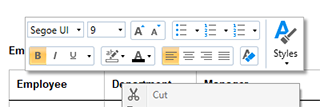
Toolbars and Mini Toolbars and Connecting Ribbon Tabs in XAML describe both.
Format Characters
Two buttons in MainWindow.xaml, <Button Content="Bold" Click="boldButton_Click" /> and <Button Content="Heading" Click="headingButton_Click" />, call these handlers in MainWindow.xaml.cs:
private void boldButton_Click(object sender, RoutedEventArgs e)
{
    // Toggle bold for the selected text or the input position
    textControl1.Selection.Bold = !textControl1.Selection.Bold;
}

private void headingButton_Click(object sender, RoutedEventArgs e)
{
    textControl1.Selection.FontName = "Arial";
    textControl1.Selection.FontSize = 320;   // 16 points, in twips
    textControl1.Selection.ForeColor = System.Drawing.Color.DarkBlue;
    textControl1.Selection.Underline = FontUnderlineStyle.Single;
}
The colors are System.Drawing.Color values, not the System.Windows.Media.Color of WPF, so the sample writes them in full; the file needs using TXTextControl;.
A Selection has these character attributes:
| Property | Sets |
|---|---|
| Bold, Italic, Strikeout | Font styles, true or false |
| Underline | None, Single, Doubled, SingleWordsOnly or DoubledWordsOnly |
| FontName | The font |
| FontSize | The size in twips, by default 200 twips (10 points) |
| ForeColor, TextBackColor | Text color and text background color |
| Baseline | Raises (positive) or lowers (negative) the text, in twips |
| AutoBaseline | Automatic superscript or subscript with a scaled font |
| Capitals | Capitals, small capitals or petite capitals for lowercase letters |
| CharacterSpacing, CharacterScaling | Additional space per character in twips, and character width in percent |
AutoBaseline, Capitals, CharacterSpacing and CharacterScaling were added in version 30.0.
Format a Range Your Code Inserted
A new Selection with a start position and a length selects and formats a range in one step when you assign it. In the Loaded handler of the control:
private void textControl1_Loaded(object sender, RoutedEventArgs e)
{
    textControl1.Text = "Quarterly Report";

    // Select characters 0 to 9 ("Quarterly") and format them
    Selection selection = new Selection(0, 9);
    selection.Bold = true;
    selection.Italic = true;
    textControl1.Selection = selection;
}
Text replaces the document with plain text. Selections and Caret Position explains selections in detail.
Format Paragraphs
Selection.ParagraphFormat takes a ParagraphFormat object with the paragraph attributes to set:
private void paragraphButton_Click(object sender, RoutedEventArgs e)
{
    ParagraphFormat format = new ParagraphFormat();
    format.Alignment = TXTextControl.HorizontalAlignment.Justify;
    format.LeftIndent = 567;       // 1 cm, in twips
    format.TopDistance = 120;      // 6 points before the paragraph
    format.BottomDistance = 120;   // 6 points after the paragraph
    format.LineSpacing = 150;      // 150 percent
    format.Frame = TXTextControl.Frame.BottomLine;
    format.FrameLineWidth = 20;
    format.FrameStyle = FrameStyle.Single;

    textControl1.Selection.ParagraphFormat = format;
}
Write TXTextControl.HorizontalAlignment in full. In a file with using System.Windows;, a plain HorizontalAlignment is ambiguous with the WPF enumeration of the same name, and the code doesn't compile. Write TXTextControl.Frame in full, too: with using System.Windows.Controls;, a plain Frame is ambiguous with the WPF Frame control.
| Property | Sets |
|---|---|
| Alignment | Left, Right, Center or Justify |
| LeftIndent, RightIndent | Indents in twips |
| HangingIndent | A hanging indent in twips; negative values indent the first line |
| TopDistance, BottomDistance | Space before and after the paragraph in twips |
| LineSpacing, AbsoluteLineSpacing | Line spacing as a percentage of the font size, or in twips |
| Frame, FrameStyle, FrameLineWidth | Frame lines: LeftLine, RightLine, TopLine, BottomLine, Box or MergedBox, single or double |
| BackColor | The paragraph background |
| KeepLinesTogether, KeepWithNext, PageBreakBefore, WidowOrphanLines | Page break rules |
| Direction | Left-to-right or right-to-left |
| StructureLevel | Level 0 to 10 for tables of contents; 0 is body text |
Tables of Contents uses the structure levels, and Right-to-Left UI covers the writing direction.
Set Tab Stops
TabPositions, TabTypes and TabLeaders are parallel arrays, one entry per tab stop, with positions in twips. MaxTabs limits a paragraph to 14 tabs.
private void tabsButton_Click(object sender, RoutedEventArgs e)
{
    ParagraphFormat format = new ParagraphFormat();
    format.TabPositions = new int[] { 2835, 5670 };                 // 5 cm and 10 cm
    format.TabTypes = new TabType[] { TabType.LeftTab, TabType.DecimalTab };
    format.TabLeaders = new TabLeader[] { TabLeader.None, TabLeader.Dot };

    textControl1.Selection.ParagraphFormat = format;
    textControl1.Selection.Text = "Item\t\t12.50";
}
TabType values are LeftTab, RightTab, CenterTab, DecimalTab, which aligns the decimal sign, and RightBorderTab. TabLeader fills the gap with Period, Dot, Dash or Underline, or not at all with None.
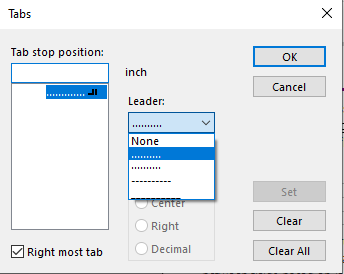
Users set the same values in the Tabs dialog box, which TabDialog opens: a list of the tab stop positions of the paragraph, the alignment and the leader of the selected tab stop, and Set, Clear and Clear All buttons:
Use the One-Click Commands
These Selection methods do what the corresponding ribbon buttons do, for the selection or at the input position:
- GrowFont and ShrinkFont change the font size in the steps that the button bar and the font dialog box offer.
- IncreaseIndent and DecreaseIndent change the left indent, to positions taken from the tab positions and the indents of the surrounding paragraphs.
- RemoveFormatting resets the character attributes to their defaults, and also the paragraph attributes when nothing or more than one paragraph is selected.
Open the Built-In Dialog Boxes
Each formatting dialog box is one method call: FontDialog, ParagraphFormatDialog, TabDialog, ForeColorDialog, TextBackColorDialog and LanguageDialog. A Paragraph... menu item, <MenuItem Header="Paragraph..." Click="MenuItemParagraph_Click" />, calls textControl1.ParagraphFormatDialog(); in its handler. Built-in Dialog Boxes lists every dialog box of the editor with its return values and the indexes of its tabs.
Keep Your Own Controls in Step
Your own formatting buttons have to reflect the text at the input position. CharFormatChanged occurs when the character attributes of the selection or the input position change, and ParagraphFormatChanged when the paragraph attributes do. Connect the handler in XAML with CharFormatChanged="textControl1_CharFormatChanged" or in the constructor of the window:
private void textControl1_CharFormatChanged(object sender, EventArgs e)
{
    // Show the font of the selection in the title bar
    if (textControl1.Selection.IsCommonValueSelected(Selection.Attribute.FontName))
    {
        Title = textControl1.Selection.FontName + ", " + (textControl1.Selection.FontSize / 20) + " pt";
    }
    else
    {
        Title = "Several fonts";
    }
}
If the selection mixes values, a Selection property returns its default value. IsCommonValueSelected with a Selection.Attribute value says whether the whole selection shares one. InputFormat returns an InputFormat object with all attributes at the input position as nullable values, such as bool? for Bold.
Next Steps
- Stylesheets: define formatting once as a named style.
- Bullets and Numbered Lists: lists and their numbering.
- Toolbars and Mini Toolbars: the formatting controls of the editor.
- Text, Paragraphs, and Stylesheets: formatting without an editor.