DPI and Display Scaling
WPF measures its layout in device-independent units and scales it to the DPI of the display, so a WPF window with TX Text Control looks right at 150% or 200% without a line of code. What remains for your application is the part WPF can't scale for you: bitmaps, such as the icons of your own buttons, which need the resolution of the display. How WPF and TX Text Control handle high-resolution displays, and how to get sharp built-in icons for your own controls, is described below.
When icons already look blurry or a call fails, DPI and Scaling in Troubleshooting starts from the symptom.
How WPF and TX Text Control Scale
- WPF applications are system DPI aware by default. WPF scales every device-independent pixel by the DPI of the system, so a window keeps its size and stays sharp on a display with the system DPI. When the window moves to a display with another DPI, or the user changes the scale factor while the application runs, Windows scales the window, which can make it blurry. Microsoft's article Developing a Per-Monitor DPI-Aware WPF Application describes this behavior.
- TX Text Control supports system DPI aware applications since version 27.0. The document, the rulers, the status bar, the ribbon tabs and the dialog boxes are drawn for the DPI of the system, with high-resolution images for all built-in parts of the user interface, on displays of 300 DPI and more.
- Per-monitor scaling is documented for Windows Forms. Version 29.0 added a
TextControlthat rescales when its window moves between displays with different DPI, and Text Control describes it for Windows Forms. For WPF, Text Control documents the system DPI awareness above.
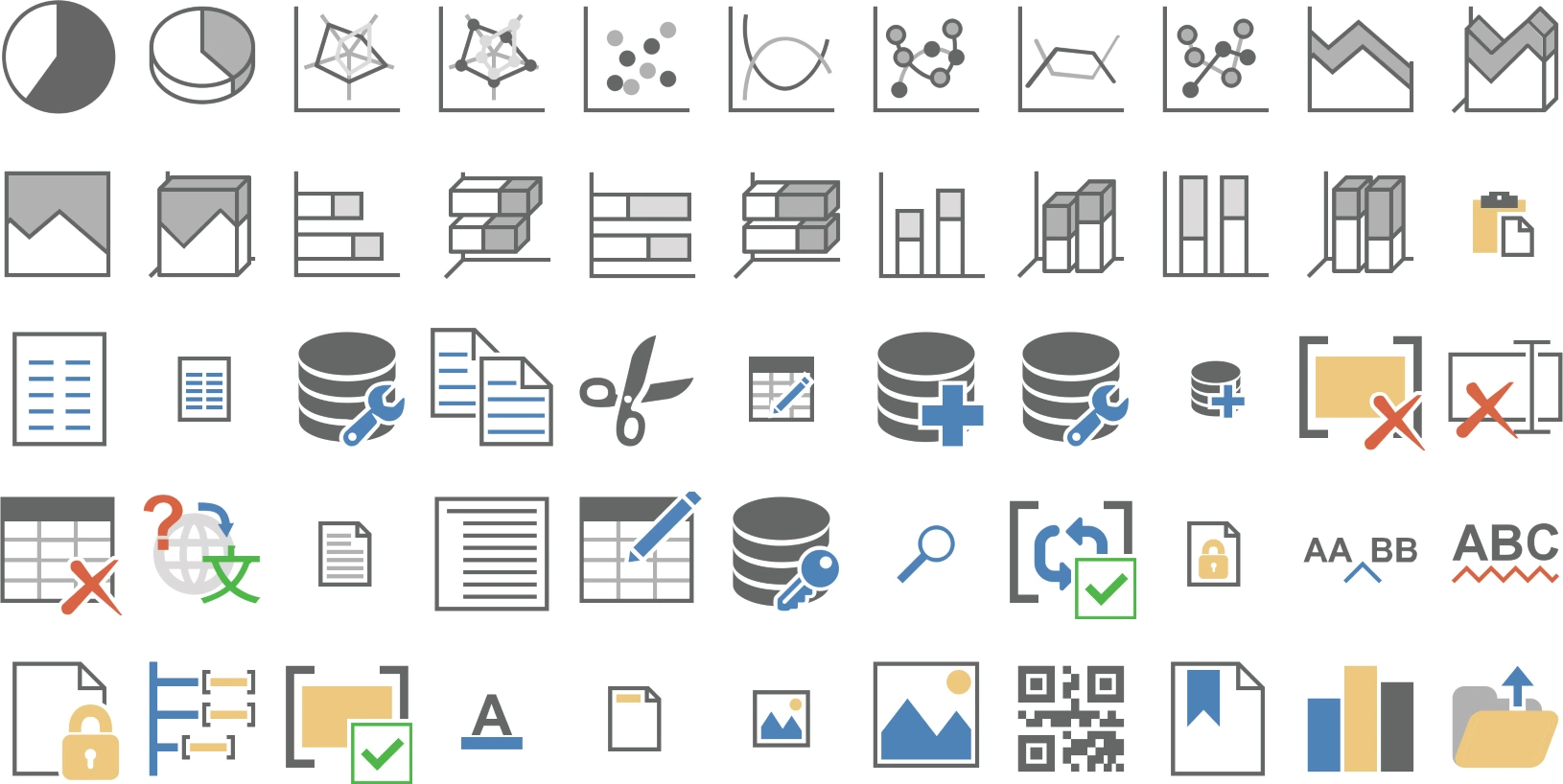
The built-in images are based on vector graphics, which TX Text Control renders in the size a resolution needs. The blog article New Icon Set Preview: Making your Applications DPI Aware introduced them and shows them at a large size:
Give Your Own Buttons Sharp Icons
A button of your own, in a ribbon tab or a toolbar, shows the image your code gives it. An image made for 96 DPI is stretched on a display with a higher DPI and looks blurry. ResourceProvider returns the built-in icons of TX Text Control as a BitmapSource in the size a resolution needs:
- GetLargeIcon returns a large icon, based on a grid of 32 × 32 pixels at 96 DPI.
- GetSmallIcon returns a small icon, based on 16 × 16 pixels.
Both take the identifier of an item, such as ResourceProvider.FileMenuItem.TXITEM_Print.ToString() or a value of the RibbonItem enumeration of a predefined tab, and either a resolution in DPI or a FrameworkElement. With an element, the icon is created for the display the element is shown on, which requires the element to be loaded.
The following code adds a print button to a ribbon group named outputGroup in the Loaded event of the window:
using System.Windows;
using System.Windows.Controls.Ribbon;
using TXTextControl.WPF;

private void Window_Loaded(object sender, RoutedEventArgs e)
{
    string print = ResourceProvider.FileMenuItem.TXITEM_Print.ToString();

    // Icons in the size the display of the window needs
    RibbonButton printButton = new RibbonButton()
    {
        Label = ResourceProvider.GetText(print),
        LargeImageSource = ResourceProvider.GetLargeIcon(print, this),
        SmallImageSource = ResourceProvider.GetSmallIcon(print, this)
    };
    printButton.Click += (s, args) => textControl1.Print("My Document", false);
    outputGroup.Items.Add(printButton);
}
The code works as follows:
thisis the window. Because it is loaded whenLoadedoccurs,GetLargeIconandGetSmallIconcan determine its DPI. Called earlier, for example in the constructor, the methods throw an exception; see DPI and Scaling.LargeImageSourceandSmallImageSourceare properties of the WPFRibbonButton. Any other WPF element that shows aBitmapSource, such as anImage, takes the icons the same way.- GetText returns the label of the built-in item in the language of the user interface.
Custom Tabs and Commands shows complete ribbon tabs of your own with these resources.
Pass the Resolution Yourself
Code without a loaded element at hand passes the resolution in DPI instead of an element. The example of the ResourceProvider in the reference reads the DPI of the window with PresentationSource in the Loaded event; DPI and Scaling in Troubleshooting shows the same code. Further overloads, with a resolution or an element, also accept a ResourceProvider.ImageSourceSettings object, whose Culture chooses language-specific icons, such as the bold, italic and underline icons for French, German and Spanish.
Next Steps
- DPI and Scaling: blurry icons, exceptions of the
ResourceProviderand zoom values out of range. - Styles, Resources, and Themes: colors and icons of the ribbon and your own controls.
- Accessibility and UI Automation: other settings that help users read and work with the editor.