
Connect Rulers, Toolbars, and a Status Bar
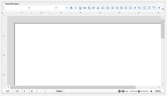
Without a ribbon, the classic WPF editor window surrounds the TextControl with three kinds of bars: a button bar for character and paragraph formatting, rulers for margins, indents and tabs, and a status bar with the input position and the zoom. Each bar is a WPF control of its own, and the editor works with it only once the two are connected by name. The sections below explain that connection, in XAML and in code, and then change which buttons the button bar offers and what the rulers and the status bar show.
Prerequisites
- A WPF project with the package
TXTextControl.TextControl.WPF.SDKand aDockPanelin MainWindow.xaml, as in the first sections of Create Your First WPF Application. If you completed that tutorial, the bars are already in the window.
The Bars
| Control | Shows and sets | Connected through |
|---|---|---|
| ButtonBar | Style, font, font size, zoom, character attributes, alignment, indents, text direction and lists | TextControl.ButtonBar |
| RulerBar, horizontal | Page margins, indents and tabs of the current paragraph | TextControl.RulerBar |
RulerBar, vertical | The top and bottom page margins | TextControl.VerticalRulerBar |
| StatusBar | The page, line and column of the input position, the zoom and other status information | TextControl.StatusBar |
All four are in the toolbox tab TX Text Control 34.0. The ButtonBar is derived from the WPF ToolBar, and its buttons and combo boxes are ordinary items of that toolbar.
Connect the Bars in XAML
The four properties of the TextControl are strings: each holds the name of a bar in the same window. The following MainWindow.xaml declares the bars, places each one with DockPanel.Dock and connects them:
<Window x:Class="MyWPFApp.MainWindow"
        xmlns="http://schemas.microsoft.com/winfx/2006/xaml/presentation"
        xmlns:x="http://schemas.microsoft.com/winfx/2006/xaml"
        xmlns:WPF="clr-namespace:TXTextControl.WPF;assembly=TXTextControl.WPF"
        Title="MainWindow" Height="450" Width="800">
    <DockPanel>
        <WPF:ButtonBar x:Name="buttonBar1" DockPanel.Dock="Top" />
        <WPF:RulerBar x:Name="rulerBar1" DockPanel.Dock="Top" ScaleUnit="Centimeter" />
        <WPF:StatusBar x:Name="statusBar1" DockPanel.Dock="Bottom"
                       ShowZoomTrackBar="False" ShowKeyStates="False" ShowSection="False" />
        <WPF:RulerBar x:Name="rulerBar2" DockPanel.Dock="Left"
                      HorizontalAlignment="Left" VerticalAlignment="Stretch" ScaleUnit="Centimeter" />
        <WPF:TextControl x:Name="textControl1"
                         ButtonBar="buttonBar1" RulerBar="rulerBar1"
                         VerticalRulerBar="rulerBar2" StatusBar="statusBar1" />
    </DockPanel>
</Window>
The XAML works as follows:
- Order and docking. The bars are placed as in Create Your First WPF Application: the
TextControlcomes last and fills the rest, and the vertical ruler is theRulerBardocked at the left whose name goes intoVerticalRulerBar. Here, each bar also setsDockPanel.Dockexplicitly. - The names.
ButtonBar="buttonBar1"and the other three attributes must match thex:Nameof a bar exactly. A name that matches no bar leaves that bar unconnected. - The ruler scale. ScaleUnit set to
Centimetershows centimeters. The default,Auto, chooses inches or millimeters from the current culture;InchandMillimeterare the other values. - The status bar. ShowZoomTrackBar decides whether the zoom factor is shown as a track bar, which also sets it, or as a number;
Falseselects the number. ShowKeyStates set toFalsehides the state of CAPS LOCK and NUM LOCK and of the insert or overwrite mode, and ShowSection set toFalsehides the number of the current section.
In the XAML Designer, you can set the same values in the Properties window: select textControl1 and type the names into ButtonBar, RulerBar, StatusBar and VerticalRulerBar, as Create Your First WPF Application shows.
Connect the Bars in Code
Because the properties hold names, code connects a bar with a string as well. The following lines connect the four bars of the window, for example in the constructor after InitializeComponent:
// Connect the bars by their names
textControl1.ButtonBar = "buttonBar1";
textControl1.RulerBar = "rulerBar1";
textControl1.VerticalRulerBar = "rulerBar2";
textControl1.StatusBar = "statusBar1";
An empty string disconnects a bar: after textControl1.ButtonBar = "";, the button bar no longer follows the text. The editor works without any bar connected.
Remove Buttons From the Button Bar
Each item of the button bar has a name, which is a value of the enumeration ButtonBar.ButtonBarItem, such as TXITEM_Bold, TXITEM_Strikeout or TXITEM_NumberedList. FindName of WPF returns the item with that name, and the Items collection of the toolbar removes it. The following MainWindow.xaml.cs removes the buttons for strikeout and structured lists when the window is created:
using System.Windows;
using TXTextControl.WPF;

namespace MyWPFApp
{
    public partial class MainWindow : Window
    {
        public MainWindow()
        {
            InitializeComponent();

            // Remove the Strikeout and the Structured List buttons
            RemoveButtonBarItem(ButtonBar.ButtonBarItem.TXITEM_Strikeout);
            RemoveButtonBarItem(ButtonBar.ButtonBarItem.TXITEM_StructuredList);
        }

        private void RemoveButtonBarItem(ButtonBar.ButtonBarItem item)
        {
            // Each item is named after its ButtonBarItem value
            if (buttonBar1.FindName(item.ToString()) is FrameworkElement element)
            {
                buttonBar1.Items.Remove(element);
            }
        }
    }
}
The code works as follows:
item.ToString()turns the enumeration value into the name of the item, for example"TXITEM_Strikeout".FindNamesearches the button bar for an element with this name. Theis FrameworkElementpattern skips the removal if no item has the name.Items.Removetakes the item out of the toolbar. WithItems.InsertandItems.Add, you can also move items or add controls of your own.
Toolbars and Mini Toolbars lists all values of ButtonBarItem.
Run the Application
Press F5. The button bar lacks the two buttons, both rulers show centimeters, and the status bar shows the zoom as a number, without the section and the key states. Click into a paragraph and drag the left indent marker of the horizontal ruler: the paragraph moves, and the button bar and the status bar follow the input position.
Next Steps
- Create a WPF Ribbon Application: the same editor with ribbon tabs instead of the button bar.
- Load and Save Documents: open and save documents from a menu.
- Rulers and Status Bar: colors, border styles and every area of the status bar.
- Toolbars and Mini Toolbars: the button bar and the mini toolbar in detail.