
Add Rulers, Toolbars, and a Status Bar
Not every application needs a ribbon. A classic editor surrounds the TextControl with a button bar for font and paragraph formatting, rulers for margins, indents and tabs, and a status bar. The steps below add these controls with the smart tag, connect them in code as an alternative, and choose which buttons and status information they show.
Prerequisites
- A Windows Forms project with the package
TXTextControl.TextControl.WinForms.SDKand aTextControlon Form1, as created in the first three sections of Create Your First Windows Forms Application. Do not add the ribbon: the button bar replaces it.
Add the Controls With the Smart Tag
- Open Form1 in the designer.
- Click the smart tag in the upper right corner of the
TextControl. - In the Wizards group, click Add a ButtonBar, Add a StatusBar, Add a Ruler and Add a Vertical Ruler.
- Click Arrange Controls Automatically.
The wizards add a ButtonBar, a StatusBar and two RulerBar controls to the form. Arrange Controls Automatically connects them to the TextControl and docks all controls so that they fill the form.
In the designer, the form now shows the button bar and the horizontal ruler at the top, the vertical ruler at the left and the status bar at the bottom:
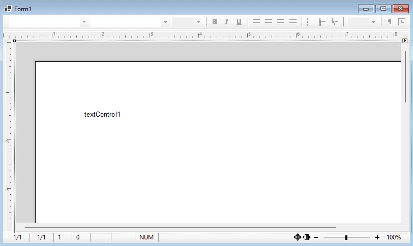
Press F5. The form shows the editor with the button bar, the two rulers and the status bar around it. Select some text and click a button of the button bar to format it: the button bar shows and sets the font and paragraph attributes of the text.
Add the Controls From the Toolbox
You can also drag ButtonBar, RulerBar and StatusBar from the toolbox tab TX Text Control 34.0 onto the form. Arrange Controls Automatically in the smart tag of the TextControl then finds the controls on the form, arranges them around the editor and adds the code that connects them.
A ruler docked at the top or bottom of the form is horizontal, and a ruler docked at the left or right is vertical: RulerBar.Alignment follows the docking.
Connect the Controls in Code
The connection is a set of properties of the TextControl, which you can also set in code, for example in the constructor of the form. Use the names the controls have on your form, shown in the Properties window:
public Form1()
{
    InitializeComponent();

    // Connect the bars to the editor
    textControl1.ButtonBar = buttonBar1;
    textControl1.RulerBar = rulerBar1;
    textControl1.VerticalRulerBar = rulerBar2;
    textControl1.StatusBar = statusBar1;
}
ButtonBar, RulerBar, VerticalRulerBar and StatusBar each connect one bar. A property that is not set is null, and the editor works without that bar.
Choose the Buttons and the Status Information
The button bar and the status bar show a default set of items, which properties change. The following lines, added to the constructor after the connections, reduce the button bar to two buttons and add a zoom slider and the key states to the status bar:
// Set all 31 positions so that unused positions contain Button.None
TXTextControl.Button[] buttons = new TXTextControl.Button[31];
buttons[0] = TXTextControl.Button.FontBoldButton;
buttons[1] = TXTextControl.Button.FontItalicButton;
buttonBar1.ButtonPositions = buttons;

// Draw a separator before the italic button, with none before the bold button
bool[] separators = new bool[31];
separators[1] = true;
buttonBar1.ButtonSeparators = separators;

// Show a zoom slider and the state of CAPS LOCK, NUM LOCK and insert mode
statusBar1.ShowZoomTrackBar = true;
statusBar1.ShowKeyStates = true;
The code works as follows:
- ButtonPositions has 31 positions. Assigning a shorter array leaves later positions unchanged. The new array sets the first two positions to bold and italic and leaves the other positions at
Button.None, so the default buttons are removed. ResetButtonPositions restores the default set. - ButtonSeparators controls the separator before each position. Index 1 draws the separator before the second button. The other entries of the new 31-element array are
false, so no leading or default separators remain. - ShowZoomTrackBar shows a track bar that displays and sets the zoom, and ShowKeyStates shows the state of CAPS LOCK, NUM LOCK and insert or overwrite mode.
Toolbars and Mini Toolbars describes more properties of the button bar, and Rulers and Status Bar those of the rulers and the status bar, such as the scale unit of the rulers and the other areas of the status bar.
Next Steps
- Load and Save Documents: add buttons that open and save documents.
- Create a Ribbon Application with Sidebar Support: build the editor with a ribbon and sidebars instead.
- Rulers and Status Bar: the rulers and the status bar in detail.