
Sidebar and Panels
Panels beside the document keep search results, styles, comments, tracked changes and merge fields in view while users keep typing. In TX Text Control .NET for WPF, the Sidebar element hosts these panels, docked in the window or floating as a dialog, and opens them when a ribbon button is clicked. The sections below place sidebars in XAML, connect them to the ribbon, show them as dialogs, adjust the elements of a panel and show a panel of your own.
Add a Sidebar adds a first sidebar step by step, and Sidebar introduces the control.
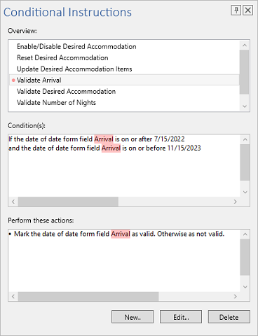
The Panels
The Sidebar derives from System.Windows.Controls.Control. Its ContentLayout selects one of the values of SidebarContentLayout, and its TextControl property holds the name of the editor the panel works with. In code, TextControl is a string with that name, like the properties that connect the bars to the editor; the reference documents it with the type TextControl, but the compiler expects a string. The panels:
| Value | Panel |
|---|---|
Find, Replace | Search, and search and replace |
Goto | A go to panel for moving through the document |
Styles | The styles of the document |
TrackedChanges, Comments | The tracked changes and the comments of the document |
FieldNavigator | The merge fields of a template |
ConditionalInstructions | The conditional instructions of the form fields |
DocumentSettings | Title, author, subject, tags, user-defined properties and embedded files |
About | A TextControl for information about your application |
Custom | An element of your own in Content |
None | No content, the default |
The reference page of the enumeration does not list About, but the value exists in the assembly, and the TX Words sample uses it for its left sidebar.
Place Sidebars in XAML
A sidebar is placed in the layout of the window like any element, usually in the DockPanel that holds the editor, before the TextControl. The following three sidebars are arranged as in the TX Words sample:
<WPF:Sidebar x:Name="sidebarBottom" DockPanel.Dock="Bottom" VerticalAlignment="Bottom"
             TextControl="textControl" IsShown="False"/>
<WPF:Sidebar x:Name="sidebarRight" DockPanel.Dock="Right" HorizontalAlignment="Right"
             TextControl="textControl" IsShown="False"/>
<WPF:Sidebar x:Name="sidebarLeft" DockPanel.Dock="Left" HorizontalAlignment="Left"
             TextControl="textControl" ContentLayout="About" ShowPinButton="False"
             DialogStyle="StandardSizable"/>
The alignment decides the layout of the panels Find, Replace, Goto, ConditionalInstructions, DocumentSettings and FieldNavigator:
HorizontalAlignment | VerticalAlignment | Layout |
|---|---|---|
Left or Right | Stretch or Center | Vertical, for a sidebar beside the document |
Stretch or Center | Top or Bottom | Horizontal, for a strip above or below the document |
| Any other combination | Dialog style |
IsShown hides the bottom and the right sidebar until a ribbon button opens them. To show or hide a sidebar in code, set IsShown; the reference recommends it over the inherited Visibility property.
Open Sidebars With Ribbon Buttons
Ribbon tabs connect their sidebar buttons by name. Each button has a property for a vertical and one for a horizontal sidebar, and the value is the x:Name of a sidebar, as in this Home tab of TX Words:
<WPF:RibbonFormattingTab x:Name="ribbonFormattingTab" Header="Home"
                         FindSidebar="sidebarRight" FindHorizontalSidebar="sidebarBottom"
                         ReplaceSidebar="sidebarRight" ReplaceHorizontalSidebar="sidebarBottom"
                         GotoHorizontalSidebar="sidebarBottom"
                         StylesSidebar="sidebarRight"/>
A button with a connected sidebar gets a drop-down to toggle the vertical or horizontal sidebar. When the user clicks the button:
- With the toggle on, the sidebar opens pinned into the window.
- With the toggle off, it opens as a dialog: one that cannot be resized for the Find, Replace and Go To buttons, a resizable one for the Comments, Tracked Changes and Conditional Instructions buttons.
- In both cases, the sidebar switches to the panel of the button, and the other sidebar connected to the same button is hidden.
One sidebar can serve several buttons, because each button sets the panel it needs.
Show a Sidebar as a Dialog
With IsPinned set to false, the sidebar opens as a dialog. The following code, in the Loaded handler of the TextControl, shows the styles in a resizable dialog:
using System.Windows;
using TXTextControl.WPF;

private void TextControl_Loaded(object sender, RoutedEventArgs e)
{
    // Show the Styles panel in a sizable dialog
    sidebarRight.ContentLayout = Sidebar.SidebarContentLayout.Styles;
    sidebarRight.IsPinned = false;
    sidebarRight.DialogStyle = Sidebar.SidebarDialogStyle.StandardSizable;
    sidebarRight.DialogSize = new Size(320, 480);
    sidebarRight.IsShown = true;
}
The code works as follows:
- DialogStyle takes a SidebarDialogStyle:
Standardis a window with a title bar that cannot be resized,StandardSizableone that can, andSidebarandSidebarSizableshow only the sidebar, without a window border or title bar. - DialogSize and DialogLocation are nullable. Left at
null, their default, the dialog is sized to its content and centered on the topmost element. - A pinned sidebar can be resized with the mouse while IsSizable is
true.
Adjust the Title and the Elements of a Panel
The title bar shows the Text of the sidebar in TitleFontFamily, TitleFontSize and TitleForeground. ShowTitle, ShowPinButton and ShowCloseButton switch its parts off.
Every element of a predefined panel has a Name, which is a value of an enumeration nested in Sidebar, one per panel: FindAndReplaceItem, GotoItem, StylesItem, TrackedChangesItem, CommentsItem, FieldNavigatorItem, ConditionalInstructionsItem, DocumentSettingsItem and AboutItem. FrameworkElement.FindName on the sidebar returns the element, for example to hide the preview option of the Styles panel:
// Hide the Show Preview check box of the Styles panel
if (sidebarRight.FindName(Sidebar.StylesItem.TXITEM_ShowPreview.ToString()) is FrameworkElement preview)
{
    preview.Visibility = Visibility.Collapsed;
}
React to Changes of the Panel
A ribbon button changes the ContentLayout of a sidebar, and your application may need to react, for example to allow the pin button only for some panels. TX Words does this with a DependencyPropertyDescriptor, which reports value changes of a dependency property:
using System;
using System.ComponentModel;

// In the constructor, after InitializeComponent
DependencyPropertyDescriptor.FromProperty(Sidebar.ContentLayoutProperty, typeof(Sidebar))
    .AddValueChanged(sidebarLeft, SidebarLeft_ContentLayoutChanged);

private void SidebarLeft_ContentLayoutChanged(object sender, EventArgs e)
{
    // Allow a dialog only for the tracked changes panel
    sidebarLeft.ShowPinButton =
        sidebarLeft.ContentLayout == Sidebar.SidebarContentLayout.TrackedChanges;
}
Sidebar.ContentLayoutProperty is the dependency property behind ContentLayout. It is public in the assembly, although the reference does not list it.
Show a Panel of Your Own
With ContentLayout set to Custom, the sidebar shows the FrameworkElement you assign to Content, with the same title bar, docking and dialog mode as a predefined panel. Content can be set only with this layout:
// Show a user control of your own, here named CustomerPanel
sidebarLeft.ContentLayout = Sidebar.SidebarContentLayout.Custom;
sidebarLeft.Content = new CustomerPanel();
sidebarLeft.Text = "Customer";
Next Steps
- Track Changes and Comments: the features behind two of the panels.
- Form Fields and Conditional Instructions: the conditional instructions panel shown above.
- Connecting Ribbon Tabs in XAML: the naming scheme the sidebar connections use.
- Ribbon and Sidebar Examples: samples with ribbons and sidebars.