Custom Tabs and Commands
Your application's own commands, such as saving to a document management system or starting an approval, belong in the same ribbon as the formatting commands of TX Text Control. The classes the predefined tabs are built from are public, so you add tabs, groups and buttons of your own in the designer or in code, and give them the icons and tool tips of the built-in items with the ResourceProvider.
How the predefined tabs are organized, and how to change or remove their items, is described in Built-in Ribbon Tabs.
The Building Blocks
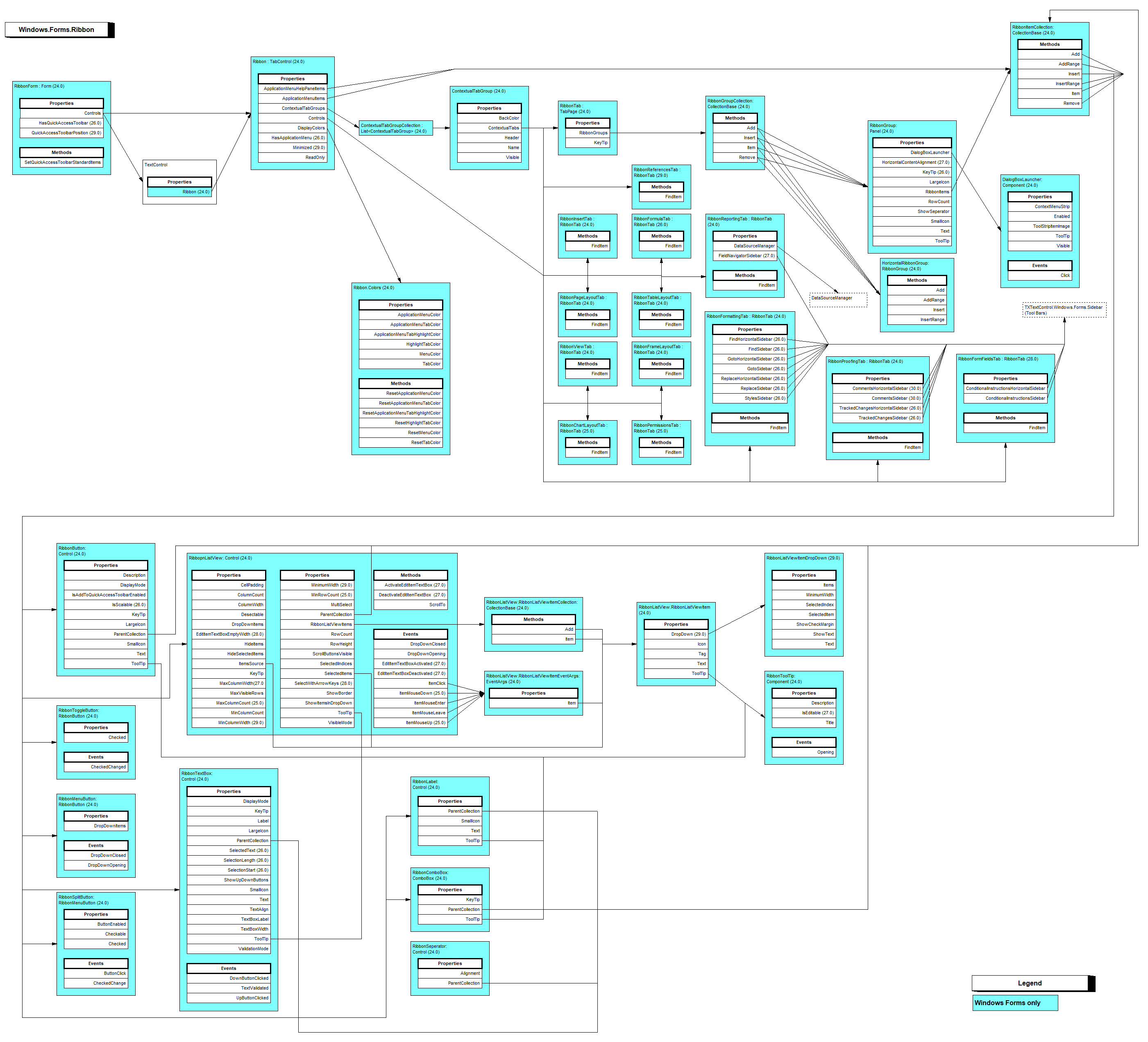
All classes are in the namespace TXTextControl.Windows.Forms.Ribbon. A RibbonTab holds groups in its RibbonGroups collection, and a group holds items in its RibbonItems collection:
| Class | What it is |
|---|---|
| RibbonGroup | A group that arranges its items in columns, with a title and an optional dialog box launcher |
| HorizontalRibbonGroup | A group that arranges its items in rows, like the Font group of the Home tab |
| RibbonButton | A button with a large or small icon and a text |
| RibbonToggleButton | A button that stays checked, with Checked and a CheckedChanged event |
| RibbonMenuButton | A button that opens a drop-down menu of the items in DropDownItems |
| RibbonSplitButton | A button with a primary part that runs a command and a part that opens a drop-down menu |
| RibbonComboBox, RibbonTextBox, RibbonLabel | A combo box, a text box with optional up and down buttons, and a label |
| RibbonListView | A gallery of items, like the style gallery of the Home tab |
| RibbonSeperator | A separator in a HorizontalRibbonGroup, the application menu or a drop-down menu; a RibbonGroup does not accept it |
All of them are Windows Forms controls, so they have the usual Name, Visible, Enabled and Click members. The diagram shows the classes with their properties and how they are nested; the version in parentheses is the one each member was introduced in:
Add a Tab in the Designer
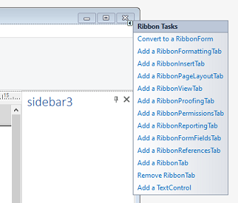
- Select the ribbon by clicking its File tab title, open the smart tag and click Add a RibbonTab.
- Set the tab's
Textproperty, which is the tab title, in the Properties window. - Find RibbonGroups in the Properties window of the tab and click its ellipsis button. Add a group in the collection editor and set its
Text. - In the properties of the group, click the ellipsis button of RibbonItems and add buttons and other items.
- Handle the
Clickevent of each button in the code of the form.
Add a Tab in Code
Code is the better choice when the commands depend on the user or on settings. The following code, in the constructor of the form after InitializeComponent, adds a Review tab with an Output group, a print button with the built-in print icon, a toggle button that makes the document read-only and a drop-down menu that exports a PDF file:
using TXTextControl;
using TXTextControl.Windows.Forms;
using TXTextControl.Windows.Forms.Ribbon;

// Create the tab and a group without a dialog box launcher
RibbonTab reviewTab = new RibbonTab() { Text = "Review" };
RibbonGroup outputGroup = new RibbonGroup() { Text = "Output" };
outputGroup.DialogBoxLauncher.Visible = false;
reviewTab.RibbonGroups.Add(outputGroup);

// A print button that looks like the built-in one
string print = ResourceProvider.FileMenuItem.TXITEM_Print.ToString();
RibbonButton printButton = new RibbonButton()
{
    Text = ResourceProvider.GetText(print),
    LargeIcon = ResourceProvider.GetLargeIcon(print, this),
    SmallIcon = ResourceProvider.GetSmallIcon(print, this),
    DisplayMode = IconTextRelation.LargeIconLabeled,
    KeyTip = "P",
    IsAddToQuickAccessToolbarEnabled = true
};
printButton.ToolTip.Title = ResourceProvider.GetToolTipTitle(print);
printButton.ToolTip.Description = ResourceProvider.GetToolTipDescription(print);
printButton.Click += (sender, e) => textControl1.Print("My Document");
outputGroup.RibbonItems.Add(printButton);

// A toggle button that switches the document to read-only
RibbonToggleButton readOnlyButton = new RibbonToggleButton()
{
    Text = "Read Only",
    DisplayMode = IconTextRelation.SmallIconLabeled
};
readOnlyButton.CheckedChanged += (sender, e) => textControl1.EditMode =
    readOnlyButton.Checked ? EditMode.ReadAndSelect : EditMode.Edit;
outputGroup.RibbonItems.Add(readOnlyButton);

// A menu button with one entry
RibbonMenuButton exportButton = new RibbonMenuButton() { Text = "Export" };
RibbonButton pdfItem = new RibbonButton() { Text = "PDF" };
pdfItem.Click += (sender, e) => textControl1.Save("document.pdf", StreamType.AdobePDF);
exportButton.DropDownItems.Add(pdfItem);
outputGroup.RibbonItems.Add(exportButton);

// Show the tab and select it
ribbon1.Controls.Add(reviewTab);
ribbon1.SelectedTab = reviewTab;
The code works as follows:
- DialogBoxLauncher is the small button in the footer of a group. Hide it when the group has no dialog to open, or handle its Click event to open one.
- ResourceProvider returns the text, the icons, the key tip and the tool tip of a built-in item for an identifier string. ResourceProvider.FileMenuItem lists items of the application menu such as print, open and save; the
RibbonItemvalues of the predefined tabs work as well, for exampleRibbonInsertTab.RibbonItem.TXITEM_InsertHyperlink.ToString(). GetLargeIcon and GetSmallIcon take the form so that the icon is drawn for its resolution. - DisplayMode takes an IconTextRelation value:
LargeIconLabeled,SmallIconLabeled,SmallIconUnlabeledorNoIconLabeled. - KeyTip sets the keyboard shortcut of the button. ToolTip is a RibbonToolTip with a title and a description.
- EditMode and Save are members of the
TextControlnamedtextControl1on the form; any code of your application can go into the handlers.
Add a Group to a Predefined Tab
A predefined tab is a RibbonTab too, so its RibbonGroups collection takes your groups. Insert places a group at a position, here before the Clipboard group of the Home tab:
// Put a group of your own at the start of the Home tab
RibbonGroup companyGroup = new RibbonGroup() { Text = "Company" };
companyGroup.DialogBoxLauncher.Visible = false;
ribbonFormattingTab1.RibbonGroups.Insert(0, companyGroup);
In the same way, FindItem returns a predefined group, and its RibbonItems collection takes buttons of your own.
Fill the Application Menu
The File tab is the application menu when HasApplicationMenu is true. Its commands are yours to add: the TX Words sample adds New, Open, Save, Save As, Print, Document Settings, About and Exit in the collection editor of ApplicationMenuItems:
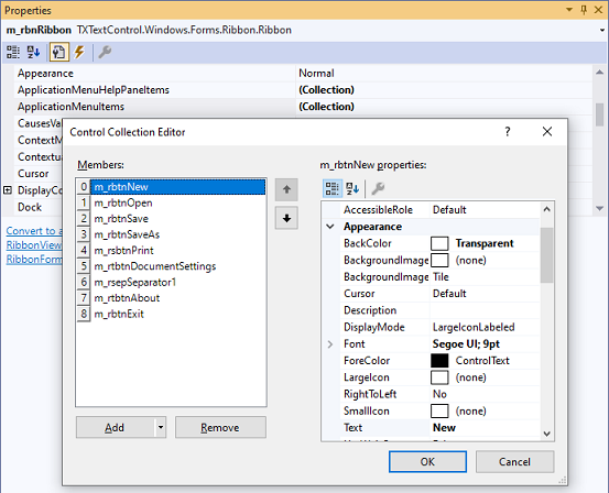
In code, add buttons to the same collection:
// An Open command in the application menu
string open = ResourceProvider.FileMenuItem.TXITEM_Open.ToString();
RibbonButton openButton = new RibbonButton()
{
    Text = ResourceProvider.GetText(open),
    LargeIcon = ResourceProvider.GetLargeIcon(open, this),
    DisplayMode = IconTextRelation.LargeIconLabeled
};
openButton.Click += (sender, e) => textControl1.Load();
ribbon1.ApplicationMenuItems.Add(openButton);
Load without parameters opens the built-in open dialog. The pane beside the commands, often a list of recent files, is filled through ApplicationMenuHelpPaneItems. Loading and Saving Documents covers the load and save methods behind such commands.
Add Items to the Quick Access Toolbar
The Quick Access Toolbar, like the headers of contextual tab groups, is drawn in the window border of a form derived from RibbonForm; Convert to a RibbonForm in the ribbon's smart tag changes the base class of your form.
- HasQuickAccessToolbar shows the toolbar, and QuickAccessToolbarPosition places it in the caption area, the default
AboveRibbon, orBelowRibbon. - SetQuickAccessToolbarStandardItems sets the items it starts with, as an array of
ToolStripItemobjects. - Users can add a ribbon button to the toolbar through its context menu when the button's IsAddToQuickAccessToolbarEnabled is
true, as for the print button above. RibbonGroup has the same property for whole groups.
The blog article Customizing the Windows Forms Ribbon shows further examples of changed and added ribbon items.
Next Steps
- Toolbars and Mini Toolbars: add ribbon groups of your own to the mini toolbar.
- Themes, Colors, and Icons: colors of the ribbon and icons for other resolutions.
- Localization and Resource Kit: texts of the ribbon in other languages.
- Built-in Dialog Boxes: dialogs your buttons can open.