Themes, Colors, and Icons
To match TX Text Control to the look of your application, you set colors and pick icons rather than switch a theme. Every visible control of TX Text Control .NET for Windows Forms has a DisplayColors property that takes a set of colors, and by default these colors follow the colors of the Windows system. The icons of the ribbon are available to your own buttons at any resolution, and color icons can be tinted. The sections below cover both.
What Can Be Colored
| Control | Property | Colors class | What it colors |
|---|---|---|---|
TextControl | DisplayColors | TextControl.Colors | The area around the pages, the page shadows, header and footer marks and form field highlighting |
Ribbon | DisplayColors | Ribbon.Colors | Tabs, the application menu and the menus of the ribbon |
RulerBar | DisplayColors | RulerBar.Colors | The rulers |
StatusBar | DisplayColors | StatusBar.Colors | The status bar |
ButtonBar | DisplayColors | ButtonBar.Colors | The classic toolbar and its buttons |
Two more properties color single parts: ContextualTabGroup.BackColor sets the background of the label of a contextual tab group such as Table Tools, and Sidebar.TitleForeColor the text color of a sidebar's title bar, by default the ARGB value (255, 43, 87, 154).
All Colors classes work the same way: you create an instance with new, set the colors you want and assign it to DisplayColors. Colors you leave unset are reset to their defaults when the object is assigned. The colors of the rulers and the status bar are described in Rulers and Status Bar, those of the button bar in Toolbars and Mini Toolbars.
Color the Editor
In page view, the BackgroundStyle property decides where the colors of the page background come from:
| Value | Page background |
|---|---|
ColorScheme | The color scheme of the system, or the colors set with DisplayColors |
ClassicColors | Dark gray |
The setting has an effect only when ViewMode is ViewMode.PageView. The following code in Form1.cs gives the editor a dark area around the pages and changes the highlighting of form fields:
using System;
using System.Drawing;
using System.Windows.Forms;
using TXTextControl;

public partial class Form1 : Form
{
    public Form1()
    {
        InitializeComponent();
        Load += Form1_Load;
    }

    private void Form1_Load(object sender, EventArgs e)
    {
        textControl1.ViewMode = ViewMode.PageView;

        // Use the colors of DisplayColors for the page background
        textControl1.BackgroundStyle = BackgroundStyle.ColorScheme;

        TextControl.Colors colors = new TextControl.Colors();
        colors.DesktopColor = Color.FromArgb(64, 64, 64);
        colors.DarkShadowColor = Color.Black;
        colors.FormFieldColor = Color.LightYellow;
        colors.ActiveFormFieldColor = Color.Gold;

        textControl1.DisplayColors = colors;
    }
}
The code works as follows:
- DesktopColor is the area around the pages. DarkShadowColor and LightShadowColor are the shadows at the right and bottom and at the left and top edges of the pages.
- FormFieldColor highlights form fields, and ActiveFormFieldColor the form field with the input position.
Color.Transparentswitches the highlighting off. - HeaderFooterLabelColor and HeaderFooterLineColor, not set here, color the label of an activated header or footer and its dividing line.
- ResetDisplayColors returns all colors to their system-dependent defaults.
The color of the text itself and of its background are formatting attributes of the document, not display colors; see Character and Paragraph Formatting.
Color the Ribbon
The ribbon connected to the TextControl is available through the Ribbon property. Its colors default to system colors. Add these lines to the Load handler above:
TXTextControl.Windows.Forms.Ribbon.Ribbon.Colors ribbonColors =
    new TXTextControl.Windows.Forms.Ribbon.Ribbon.Colors();
ribbonColors.ApplicationMenuTabColor = Color.FromArgb(0, 99, 177);
ribbonColors.HighlightTabColor = Color.FromArgb(0, 99, 177);

// The property is null when no ribbon is connected
if (textControl1.Ribbon != null)
{
    textControl1.Ribbon.DisplayColors = ribbonColors;
}
Ribbon.Colors has these properties:
| Property | Color of |
|---|---|
| TabColor | The background of a ribbon tab |
| HighlightTabColor | A selected tab |
| ApplicationMenuTabColor | The first tab, which opens the application menu (the File tab) |
| ApplicationMenuTabHighlightColor | The first tab while the mouse pointer is over it |
| ApplicationMenuColor | The background of the application menu |
| MenuColor | The menus of the ribbon |
Built-in Ribbon Tabs describes the ribbon itself.
Use the Icons of TX Text Control
The static methods of the ResourceProvider class return the icons, texts, tooltips and key tips of the built-in ribbon tabs and toolbars. Your own buttons can use them to look like the built-in ones. An item is identified by a string, the name of a value of the item enumerations of the ribbon tabs or of the ResourceProvider, such as TXITEM_Print or TXITEM_TextColor.
GetSmallIcon and GetLargeIcon return a System.Drawing.Bitmap for a resolution given in DPI or taken from a control. An ImageSourceSettings object adds options:
- FillColor and StrokeColor change the color rectangle of color icons such as
TXITEM_TextColor,TXITEM_TextBackColororTXITEM_PageColor. The reference lists the icons each property affects.null, the default, keeps the default color. - Culture selects icons that differ by language; Localization and Resource Kit explains which.
The following method creates a small text color icon with a red color rectangle in the resolution of the TextControl, for a button of your own:
using System.Drawing;
using TXTextControl.Windows.Forms;

private Bitmap CreateTextColorIcon()
{
    ResourceProvider.ImageSourceSettings settings = new ResourceProvider.ImageSourceSettings();
    settings.FillColor = Color.Red;

    // The resolution is taken from textControl1, whose handle must exist
    return ResourceProvider.GetSmallIcon("TXITEM_TextColor", textControl1, settings);
}
The using directives go at the top of Form1.cs and the method into the class. The overloads that take a control throw an exception if the handle of that control has not been created.
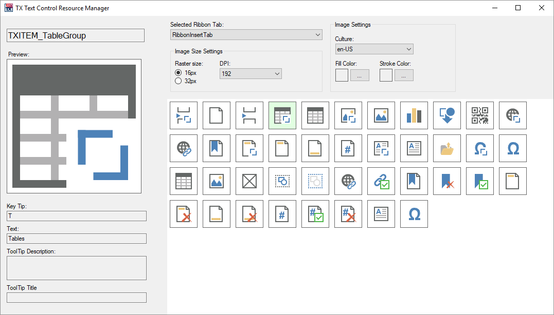
Text Control published a Resource Manager tool on GitHub that lists the identifiers and previews the icons with their DPI, culture and colors. The blog article X17: Using the Windows Forms Resource Provider introduces it:
Next Steps
- Custom Tabs and Commands: build ribbon items with these icons.
- Rulers and Status Bar: the colors of the rulers and the status bar.
- Localization and Resource Kit: texts and icons in other languages.
- Built-in Ribbon Tabs: the tabs whose colors you change.