
User Interface
To fit the Document Viewer into your own page layout or translate it for your users, you adapt its user interface. Your code docks, shows, hides and disables the toolbar, turns text selection on and off, switches to full screen, chooses the desktop or mobile view and replaces the texts the viewer shows.
The examples change the view of the ASP.NET Core tutorial. How the viewer is sized in its container is described there, in "Dock the Viewer".
The Parts of the User Interface
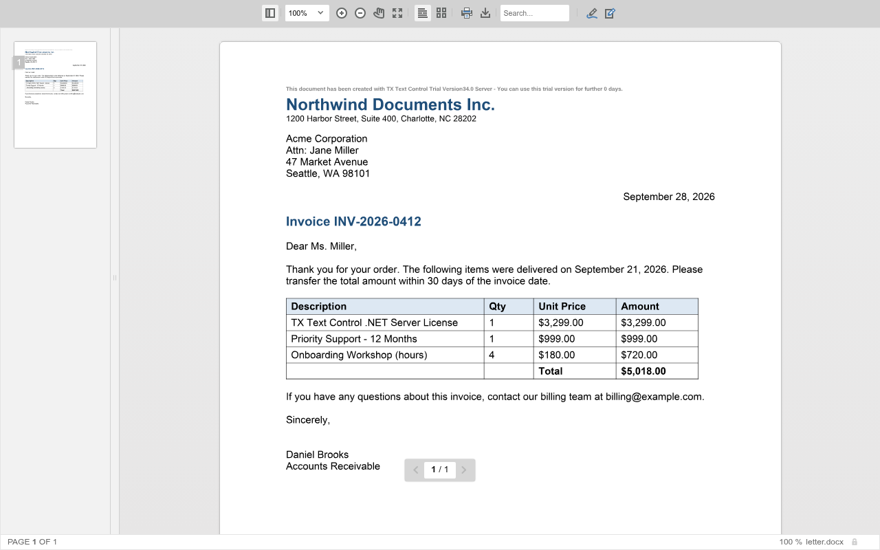
- The toolbar contains the main functions: the thumbnail sidebar, zooming and panning, full screen, text selection, the two-page view, printing, downloading and the search box. It also opens the toolbars for annotations and tracked changes.
- Contextual toolbars appear for a function, such as the annotation toolbar with its pens and stamps, or the toolbar for tracked changes.
- The status bar shows the document name, the page number and the zoom lock.
- Sidebars show the page thumbnails and the comments of annotations.
- Bars for forms and signatures tell users that a document contains form fields to fill out or signature boxes to sign.
- The page navigator at the bottom of the pages shows the current page and moves to the previous or next page.
The Buttons of the Toolbar

From left to right, the toolbar contains these items, named by their tooltips:
| Item | Does | Described in |
|---|---|---|
| Show and hide thumbnail sidebar | Shows or hides the page thumbnails | Navigation |
| Zoom drop-down list, Zoom in, Zoom out | Set the zoom factor | Zooming |
| Pan around the document | Drags a zoomed page | Zooming |
| Enable and disable full screen mode | Switches the full screen mode | This page |
| Enable and disable document selection | Turns text selection on or off | This page |
| Toggle two page mode | Switches between one page and two pages side by side | Navigation |
| Print the document | Prints with the print function of the browser | Printing |
| Download the document as PDF | Downloads the document as a PDF file | Printing |
| Search box | Searches the document for the text users enter | Search |
| Toggle the annotation toolbar | Shows or hides the annotation toolbar | Annotations |
| Toggle the tracked changes toolbar | Shows or hides the tracked changes toolbar | Tracked Changes |
The tooltips are string resources of the viewer, which Replace the Texts of the Viewer changes.
The functions of the toolbar are described on their own pages: Navigation, Search, Zooming, Printing, Annotations and Tracked Changes.
Configure the Viewer in the View
Three settings of DocumentViewerSettings change the user interface when the viewer starts. The following view shows a floating toolbar, turns text selection off and forces the desktop view. Replace the content of Views/Home/Index.cshtml:
@using TXTextControl.Web.MVC.DocumentViewer
@using System.Text

<div style="width: 800px; height: 600px;">

@Html.TXTextControl().DocumentViewer(settings => {
    settings.DocumentData = Convert.ToBase64String(
        Encoding.ASCII.GetBytes("<strong>Sample Content</strong>"));
    settings.Dock = DocumentViewerSettings.DockStyle.Fill;
    settings.ToolbarDocked = false;
    settings.IsSelectionActivated = false;
    settings.View = DocumentViewerSettings.ViewMode.Desktop;
}).Render()

</div>
The code works as follows:
- ToolbarDocked with
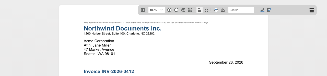
falsereplaces the toolbar at the top of the viewer with a floating toolbar in the upper right corner, which users open with a click. By default, the toolbar is docked. - IsSelectionActivated with
falseturns text selection off. By default, users can select text and copy it to the clipboard. - View selects a value of ViewMode:
Desktopfor a view optimized for desktop devices orMobilefor mobile devices.
Run the application: the viewer shows a small toolbar button in its upper right corner instead of the toolbar. A click on the button opens the toolbar next to it:
In Angular, React and a plain JavaScript page, the first two settings are named toolbarDocked and isSelectionActivated; see the property tables of Angular and React.
The Mobile View
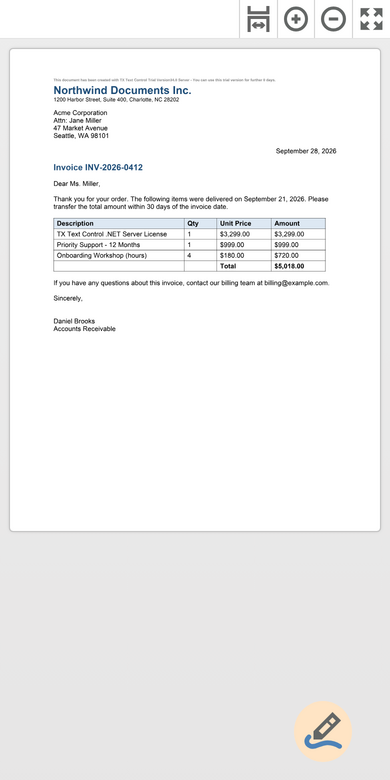
The mobile view is designed for iOS and Android devices. It has a smaller button bar, and a round button in the lower right corner opens the buttons for annotations and signatures. If View isn't set, the viewer detects the device and chooses the view itself.
The button bar of the mobile view has the buttons Zoom to the page's width, Zoom in, Zoom out and Enable and disable full screen mode:
The blog article DocumentViewer Mobile-Friendly View Released shows the mobile view.
Control the User Interface From Code
TXDocumentViewer.toolbar returns the Toolbar object. The following buttons show and hide the toolbar, switch text selection and full screen and disable the toolbar while a document is loaded. Add them below the viewer's div in the view above:
<input type="button" value="Show or Hide Toolbar" onclick="toggleToolbarVisibility()" />
<input type="button" value="Open or Close Floating Toolbar" onclick="TXDocumentViewer.toggleToolbar()" />
<input type="button" value="Text Selection" onclick="TXDocumentViewer.toggleSelection()" />
<input type="button" value="Full Screen" onclick="TXDocumentViewer.toggleFullScreen()" />
<input type="button" value="Load Document" onclick="loadWithDisabledToolbar()" />

<script>
    // The toolbar has no method that returns its visibility
    var toolbarVisible = true;

    function toggleToolbarVisibility() {
        if (toolbarVisible) {
            TXDocumentViewer.toolbar.hide();
        } else {
            TXDocumentViewer.toolbar.show();
        }
        toolbarVisible = !toolbarVisible;
    }

    async function loadWithDisabledToolbar() {
        TXDocumentViewer.toolbar.disable();
        try {
            await TXDocumentViewer.loadDocument(btoa("<strong>Loaded with JavaScript</strong>"), "loaded.html");
        } finally {
            TXDocumentViewer.toolbar.enable();
        }
    }
</script>
The code works as follows:
- hide and show hide and display the toolbar. Because no method returns whether the toolbar is visible, the page keeps the state in a variable.
- toggleToolbar opens and closes the floating toolbar that
ToolbarDocked = falsecreates. To hide a docked toolbar, usehide. - toggleSelection turns text selection on or off.
- toggleFullScreen switches between the full screen mode of the browser and the normal, docked viewer.
- disable and enable disable and enable the toolbar.
loadWithDisabledToolbardisables the toolbar until the promise ofloadDocumenthas settled.
The methods of TXDocumentViewer exist only after the viewer has raised documentViewerLoaded, so the buttons work once the viewer is loaded.
Items and Contextual Toolbars
The Toolbar object also has getItems and setItems for the items of the toolbar, and contextualToolbars, an array of ContextualToolbar objects with show and hide methods. The reference describes the items only as an array and doesn't list the built-in items, and ToolbarButton documents the members of a button but no way to create one. To offer functions of your own, add HTML buttons to your page that call the JavaScript API, as the examples of this section do.
To show a specific contextual toolbar, use annotations.showToolbar or trackedChanges.showToolbar. The reference lists version 32.4.1 for the members of the toolbar objects.
Replace the Texts of the Viewer
The viewer has no setting for the language of its user interface. Instead, its texts, such as the tooltips of the toolbar, the texts of the status bar and the dialog boxes, are string resources with names such as TX_PAGE (the "Page" text of the status bar) and TX_MENU_PRINT_TITLE (the tooltip "Print the document"). Your application replaces some or all of them:
- ASP.NET Core view. DocumentViewerSettings.ResourceManager takes a .NET
ResourceManagerwith custom resources. All resources it contains replace the texts with the same names. - Angular and React. The
resourcesproperty of the component takes an object with the names and texts, for example[resources]="{ TX_PAGE: 'Página', TX_PAGE_OF: 'de' }"in Angular.
For the ASP.NET Core view, add a resource file to the project, for example DocumentViewer.resx with the access modifier Public, add an entry with the name TX_PAGE and the value PAGE NUMBER, and pass the generated class's ResourceManager:
@Html.TXTextControl().DocumentViewer(settings => {
    settings.DocumentPath = "App_Data/template.docx";
    settings.Dock = DocumentViewerSettings.DockStyle.Fill;
    settings.ResourceManager = MyViewerApp.DocumentViewer.ResourceManager;
}).Render()
MyViewerApp stands for the root namespace of your project. The status bar then shows "PAGE NUMBER" instead of "Page". The blog article Angular DocumentViewer: Translating Resources lists the names of the resources. It was published in 2022, so compare the list with the texts your version shows.
The Document Editor's user interface is localized differently, with a UI culture; see Localization.
Next Steps
- Navigation: the thumbnail sidebar and links.
- JavaScript API: all objects and methods of the viewer.
- Annotations: the annotation toolbar and the comments sidebar.